Visual Analysis and Exploration
of the 2016 US Presidential Debates
Created by Mennatallah El-Assady and Valentin Gold
Tweet #LingVisIn the last weeks, the whole world has been anticipating the US presidential debates. The three televised debates between Donald J. Trump and Hillary Clinton have been watched by millions of people and data from Nielsen Media Research reveal that these debates are the most-watched debates of an election cycle. This website gives a unique view into the debates from different perspectives based on the oral minutes. As part of the VisArgue project, we developed different techniques to automatically analyze and visualize argumentation patterns in multi-party conversations. These techniques are part of the LingVis Framework. The four interactive visualizations presented on this website were automatically generated without any manual editing of the data. For more information about the visualization techniques, please consult the corresponding publications and videos. For a demo access to the online visualizations, please visit https://demo.lingvis.io/.
Content Overview
In order to get a high-level overview of the content of the debate and the order in which topics are discussed, we use Lexical Episode Plots. This visualization technique is based on the concept of lexical chaining. Hereby, we compute word-chains that appear with a high density in a certain part of the text and determine their importance through the compactness of their appearance. These episodes are visualized as bars on the left-hand-side of the text. Horizontal lines on each episode-bar indicate its appearance in the text. The text is shown on the right and each utterance (speaker-turn) is abstracted by one box with each sentence as one line. This visualization supports a smooth uniform zooming from the text level to the high-level overview, which enables both a close-reading of the text and a distant-reading using the episodes. In addition, a user can interactively select episodes which get highlighted in the text with the same color for the episode.

Lexical Episode Plots
Lexical Episodes are defined as a portion within the word sequence where a certain word appears more densely than expected from its frequency in the whole text. For example, if the text contains 100 words and a certain word appears four times within the whole corpus, we would assume -with an equidistant distribution- that this word would appear every 25 words in the text. However, if the actual distribution of this word is more dense in a certain part of the text, we define this as an episode.
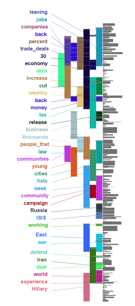
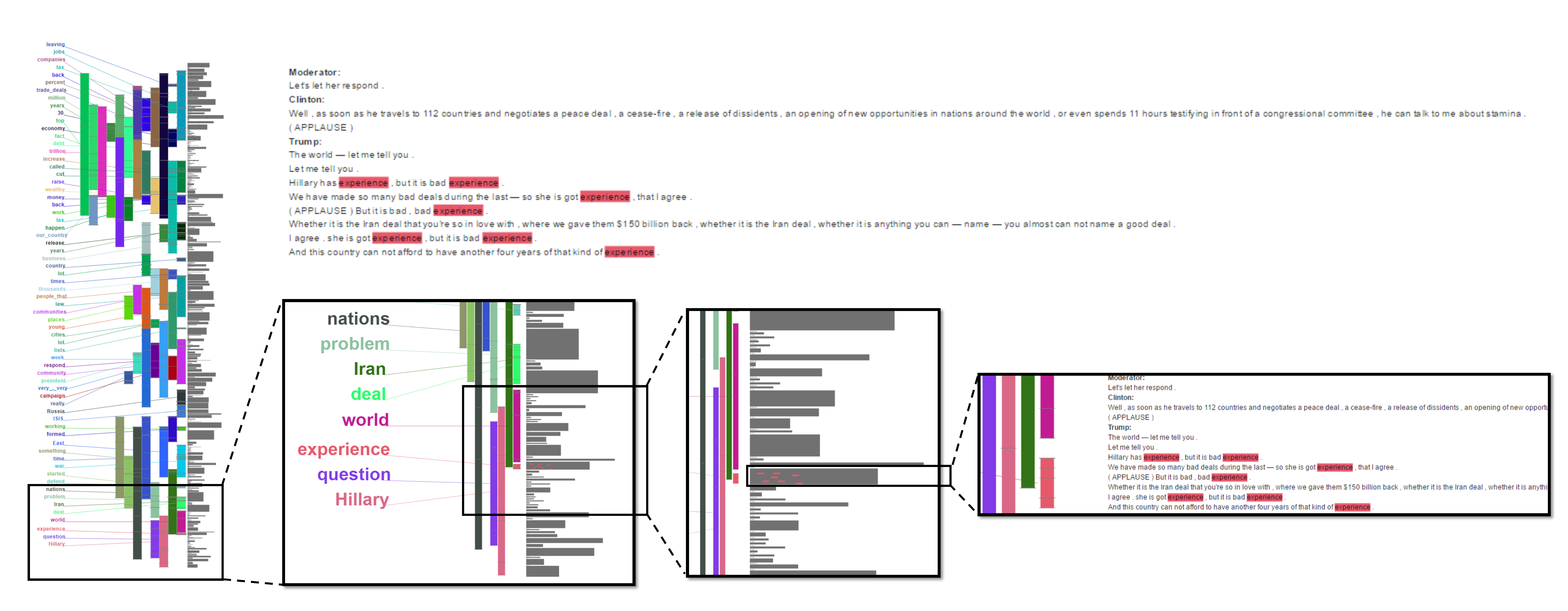
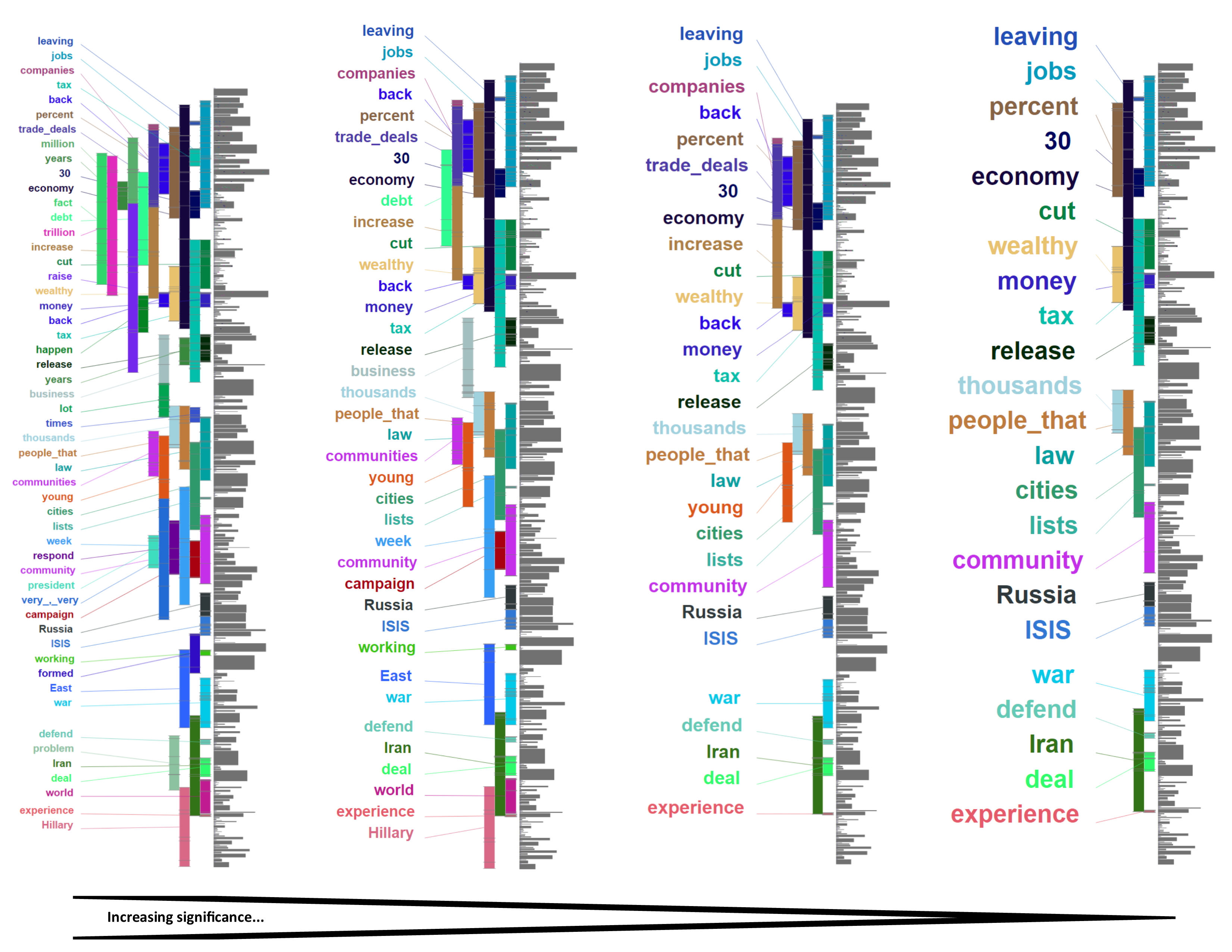
In addition to zooming and highlighting, the user can interactively change the level of detail in the visualization by changing the significance level of the episode detection. In the figure below, the first debate is visualized with four different levels of detail, increasing the significance from left to right to filter for more compact - and potentially more important - episodes. It is interesting to follow the main themes of the conversation and detect some unexpected outlier words within the debate. In contrast to other debates we have analyzed, this debate indicates a lot of repetitions within the same area in the text. This is mostly due to the rhetorical style of Trump, repeating words like: "our country", "experience", "people that", "very very", and "30" (referring to Clinton being involved in politics for 30 years).
In the following, we want to highlight some of the findings based on the Lexical Episode Visualization. In general, the visualization leaves the interpretation to the researchers, so please note that the findings most likely allow for more than one visual interpretation.
Second presidential debate
We can use the visualization of the second presidential debate to disentangle rhetoric elements. With an increase in the level of detail, these rhetorical elements are visualized. For instance, Trump uses the phrases "We're going to make America great again.", "We're going to make America safe again.", and "We're going to make America wealthy again." several times to emphasize his agenda. If we go into detail and highlight these words in comparison to the original topic (women), we see that these phrases are used as rhetorical elements to switch the topic and present the audience with something to remember.

Third presidential debate
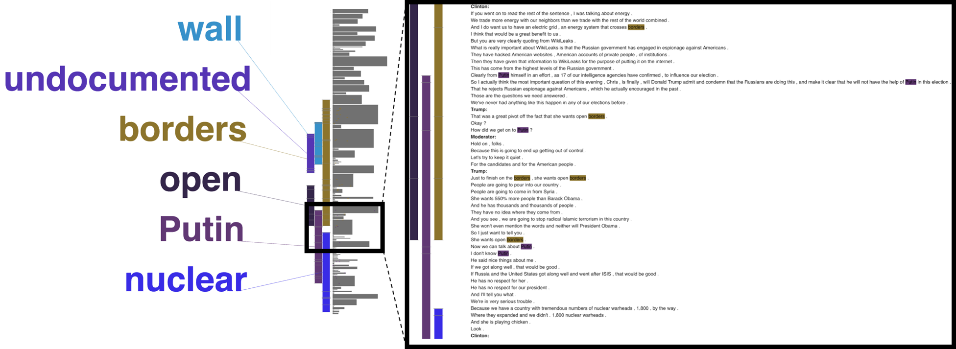
For the third presidential debate, we highlighted a section in which the candidates - probably unintentionally - slipped into a different topic. In the example presented below, orginally, the moderator asked the candidates to present their ideas on immigration. This can be seen in the figure by the words "wall", "undocumented (immigrants)", "open", and "border". In the presented turns, the moderator first introduced a quote from WikiLeaks to the debate. Even though this quote relates to the topic of immigration and open borders, Clinton eventually referred to the Russian government and Putin as being responsible for the WikiLeaks hacks. She then forwarded a (rhetorical) question to the audience to aks for Trump's position towards Russia and Putin. Both, Trump and the moderator seemed to be surprised about this change of topic but the moderators agreed to continue and give Trump the chance to respond to the question by Clinton.
Concept Relations
This visualization gives an insight on the relationship between different concepts mentioned in the debate. It can be thought of as a mind map of what the speakers brought onto the conversation floor. Using the Named-Entity Relationship Exploration tool, we can reconstruct all concepts mentioned in the debate and explore their relation to get a more wholistic picture of the content.
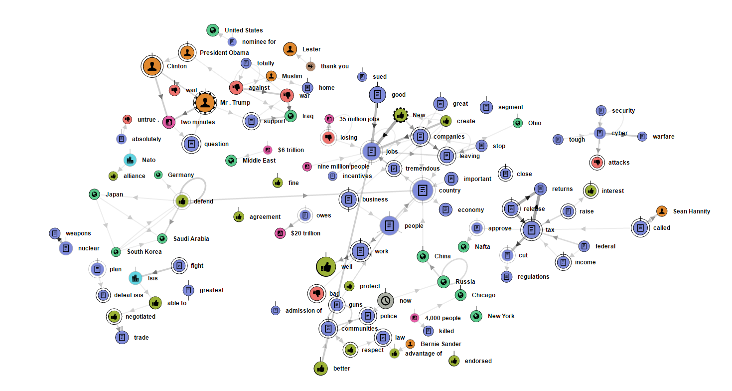
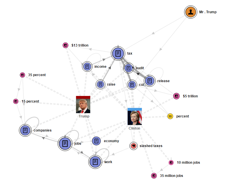 In addition, we can also focus on specific aspects that appear interesting for further analysis. For example, the figure on the left-hand side shows all entity relation mentioned with regard to the subject of taxes. Each speaker is connected to the entities s/he contributed. We can clearly spot the emphasize of Clinton towards the release of the tax returns of Donald Trump. The figure below shows the complete debate, we can identify sub-structures within the network that indicate the most important aspects of the debate as "creating jobs", "taxes", "African-American communities", "the fight against ISIS", in addition to some moderational issues.

Named-Entity Relationship Exploration
The named-entities are categorized in ten different categories, as shown in the right-hand figure. Using these entities we extract entity pairs that occur within a close proximity in the text, as shown below. Frequent entity pairs are used to generate graph structures which are visualized using a force-directed layout. This interactive visualization can be used to explore the complete debate in order to get an overview, as well as selected concepts.
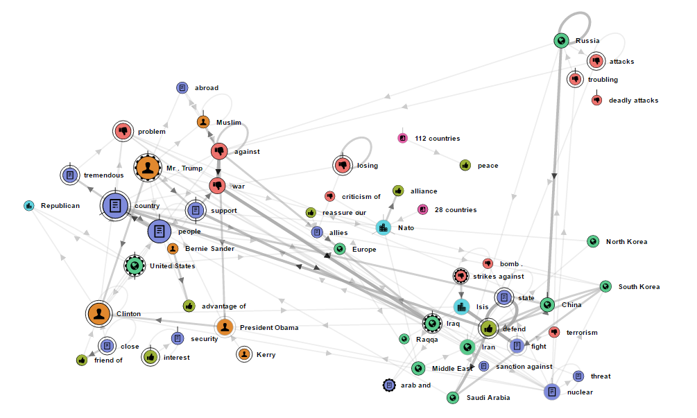
In the graph below we focused on the subject of "war on terror". Hereby, we anchored the location nodes to their approximate longitude and latitude on the canvas. This graph reveals the association of certain entities with some counties or speakers. For example, we can see Russia surrounded by negative entities about the bombings in Syria. We can see Europe as an allay and the 28 member countries of the Nato that forms an alliance. In addition, we can also notice the accusation of Trump supporting the war against Iraq and being against Muslims. On the other hand, Clinton is often associated with President Obama and John Kerry.
Speaker Interaction
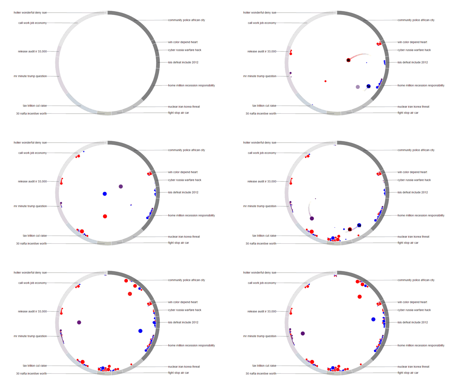
Another important aspect when analyzing a debate is the interaction between speakers. To capture that, we introduce the concept of a Topic-Space in our paper. This Conversation-Topic-Visualization (or short ConToVi) reconstructs the conversation-floor by mapping the topics of a debate to the outside of a circular chart, called Topic-Space View. We use this to model the speaker movement within a conversation with respect to the topics of their utterances. The animated figure below shows the interaction between the three speakers. Trump is shown in red, Clinton in blue, and the moderator in purple. We can clearly detect the moderation topic at 8 o'clock. We can also spot topics that are dominated by Trump, like "his tax audit"or "NAFTA". And topics that are dominated by Clinton, like "defeating ISIS" or "recession responsibility". Another interesting finding is that Trump has many large utterances, whereas Clinton has many very small utterances and only a few large ones. This indicates that he used all his designated time for each question talking without interference, while she was interrupted quite often.

Topic-Space Views
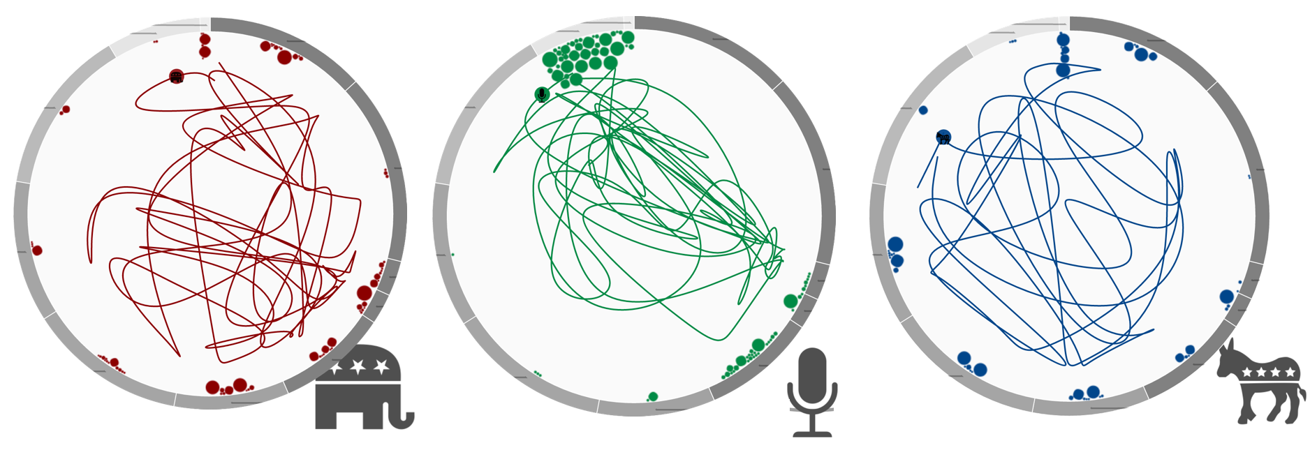
Topic-Space Views are based on the result of automatic topic modeling. These animated visualizations are constructed by using the topics of a conversation to span a circular space in which each utterance can be placed according to its membership degree to each topic, using a force-directed layout. By interpolating between the position of consecutive utterances of one speaker, we can reconstruct their paths within the Topic-Space. These paths are used in the animated view to show the movement and interactions of speakers. In addition, we can plot the complete path of every speaker individually to show how much space s/he has covered during the complete debate. As shown in the figure below, Trump has been contributing to all topics, whereas the moderator was very restricted to a passive moderation style. Clinton has covered some of the conversation-floor but was more restraint than Trump, as her path is not as dominant or active as his.

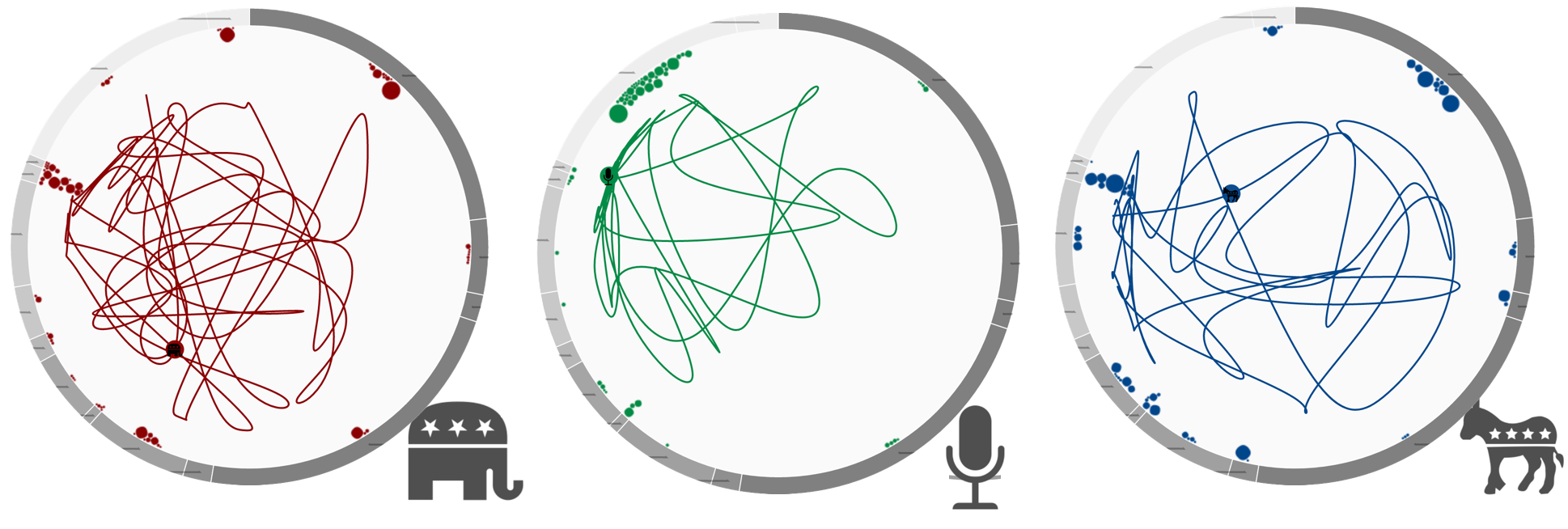
For the second and third presidential debate, the speaker paths look different. Both, Clinton (blue) and Trump (red), refer to most topics at least once in each debate. This is illustrated not only by paths themeselves but also by the speaker turns (circles). For the moderators (green), we see that the speaker turns cumulate in only some of the topics revealing those topics of agenda control. This becomes evident in all of the three debates. Comparing Trump and Clinton, only marginal differences can be seen. The most striking difference is the "smoothness" of the paths. While Trump's path appears to be rather smooth, indicating less quick topic changes, Clinton more actively combines different topics in each of her turns.
Second presidential debate
Third presidential debate
Speaker Recurrence
Speaker Recurrence captures whether the candidates talk to each other and to the same topics instead of "next to each other". The basic idea of recurrence is to map the similarity of sequential turns within a discourse. This illustrates whether the candidates actually listen and respond to each other and take the questions by the moderators. To visualize the similiarties between the turns, we propose Topic Recurrence as a visual analytics tool to get insights into the debates.

Topic Recurrence
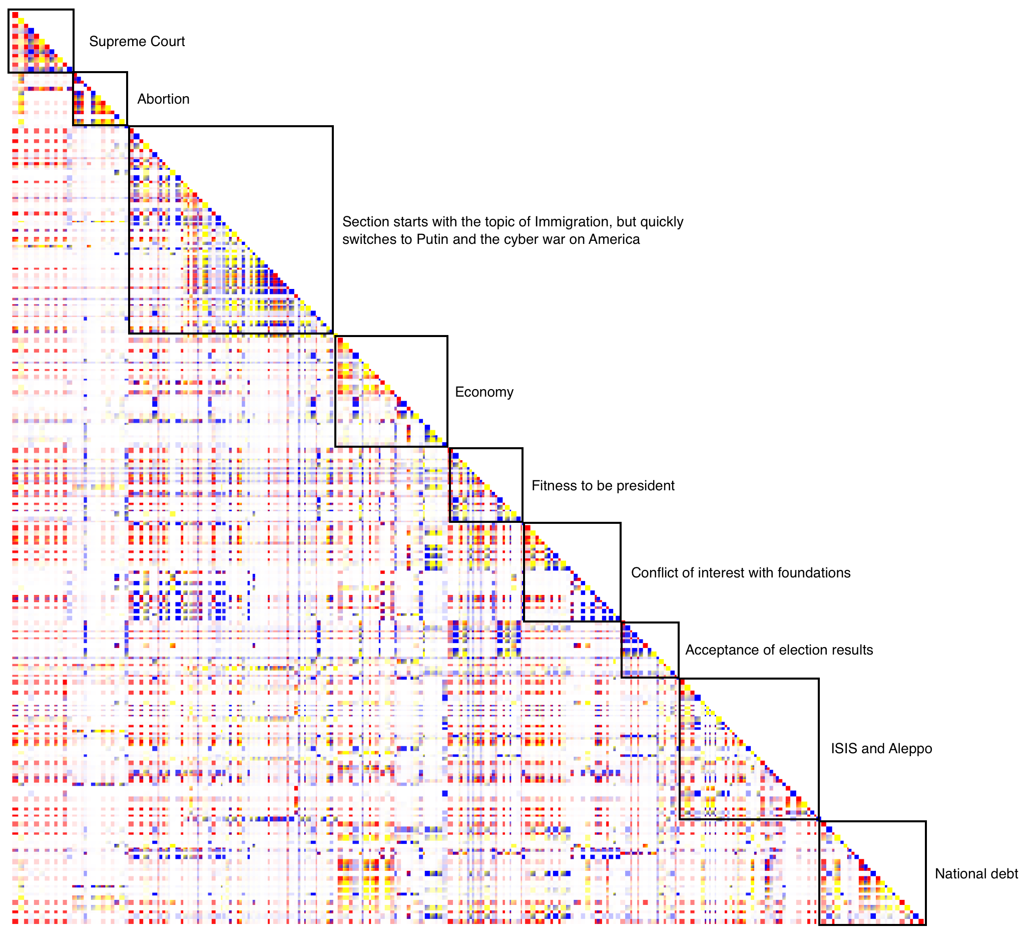
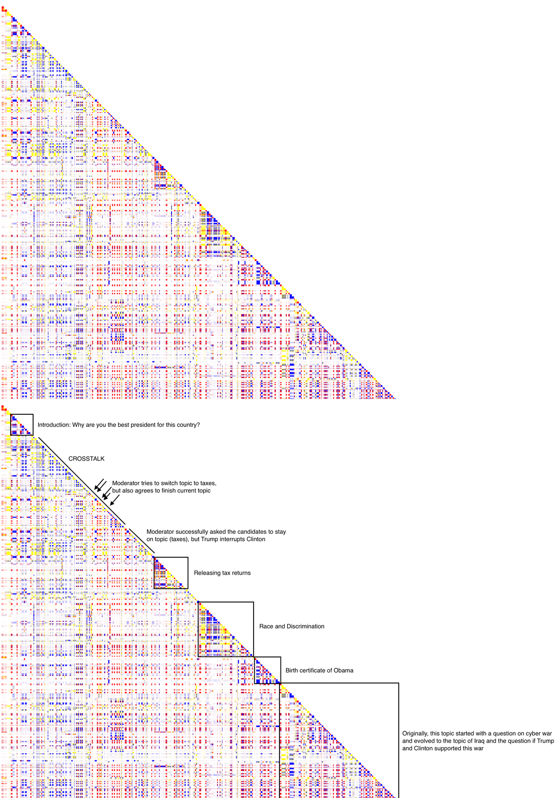
Orginally, the measure was introduced by Angus et al. (2012) and was used to indicate conceptual recurrence. Contrary to the specification by Angus et al., we rely on topic similarity to map recurrence. The figure below illustrates the principle of topic recurrence. Please note that this visualzation is a prototype and not yet integrated in the LingVis framework. In the figure, the actual turns are mapped on the diagonale - with the first turn on the upper left part of the triangle. The first blue rectangle mirrors the first introductiory words by the moderators. Then, Clinton (the yellow rectangle) replied to the question before the the moderator handed over the question to Trump. The rectangle on the left side of the diagonale demonstrate how similar the turns are. The more saturated the color, the more similar the turns with respect to their topics. In the beginning of the debate, we see that the moderators' turns (blue rectangles) are less similar to the candidates' tunrs. This is to be expected as the moderators most often structure the debate and pose smaller questions to the two candidates. However, we see that Trump in his first turn (red rectangle) agrees with Clinton and takes similar topics than her. In his later turns, Trump even more refers to the first turn of Clinton. This can be seen by the more saturated yellow-redish rectangles in the lower part of the figure (in the second column).
Let's turn to the three presidential debates. Since the Topic Recurrence Visualization is not yet part of the VisArgue framework, we have manually highlighted and labeled interesting sections within the debates. To give an impression of the unlabeled and labeled visualization, in the figure below, we have included both versions of the first presidential debate. In the unlabeled visualization, some triangles of recurrence can be seen. For instance, right in the beginning, the moderator poses the question why each of the two candidates is the best president for this country. However, then the debate slipped into a longer section of crosstalk where both candidates try to control the agenda. The moderator finally got the candidates back on tracks to discuss the different opinions on taxes.
Second presidential debate
In the second debate, the first insight is the dominant blue color within the visualization. This hints at strong moderators setting and controlling the agenda of this debate. In comparison to the first debate, more coherent sections of recurrence can be seen. However, there are some discussions on the moderators' time-keeping.
Third presidential debate
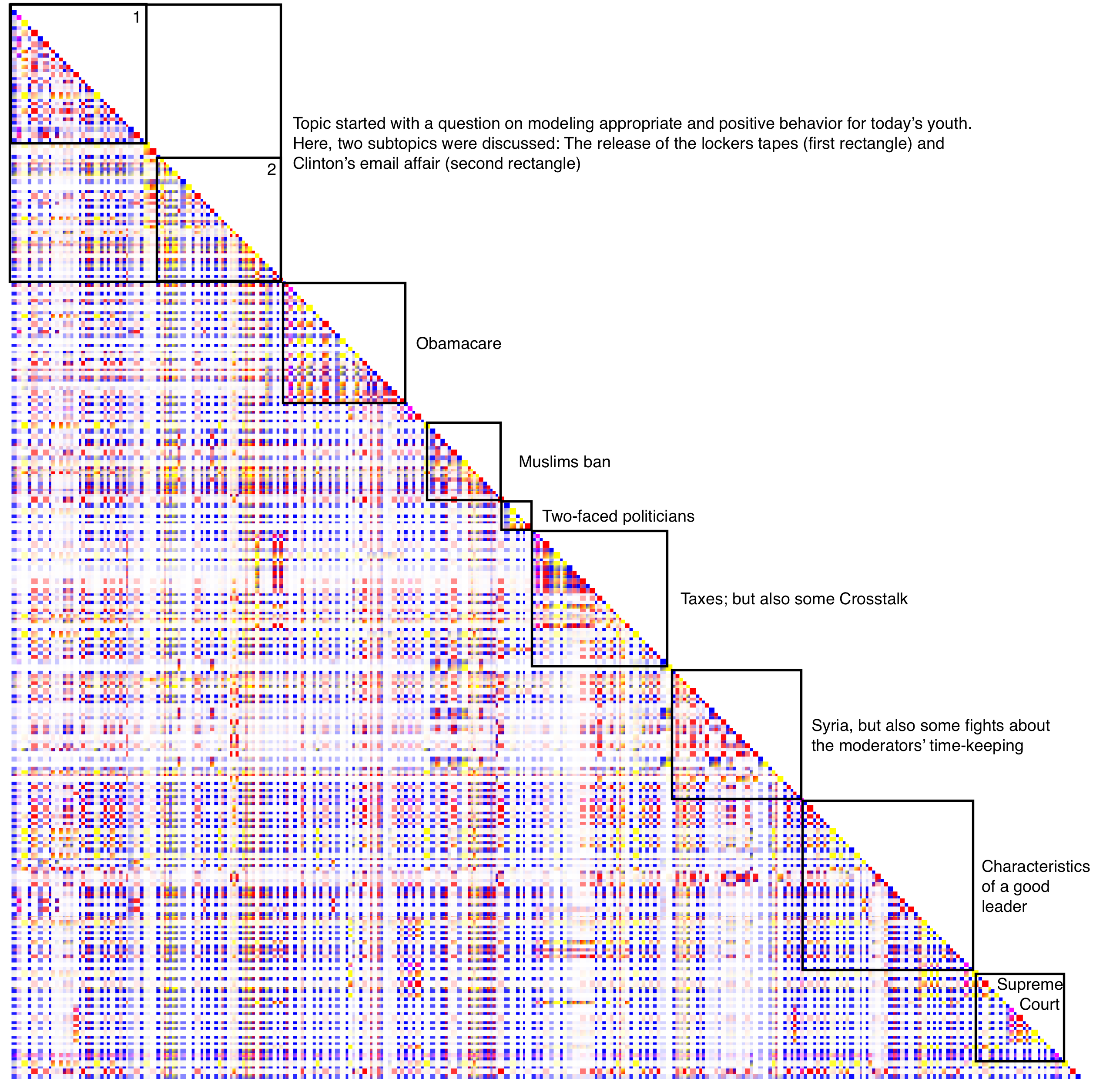
Finally, the visualization of the third debate reveals the most coherent debate out of the three. Throughout the debate, coherent segments of intense recurrence can be seen - moving down on the diagonal. The third rectangle mirrows the findings as presented in the Lexical Episode Plots when we demonstrated how the debate slipped into a different topic.
